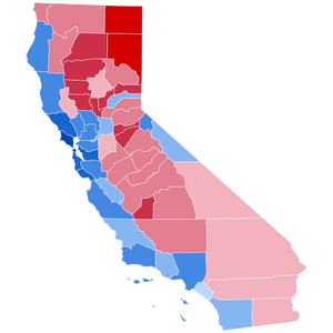
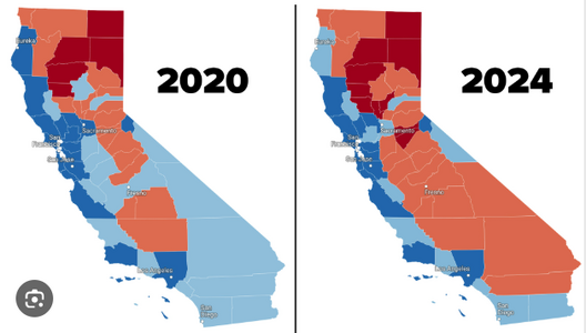
🌎 This is as rich as it can get. "Newsome's contradictions (cough) are fascinating?" "Trump lies about what he's doing when he's actually doing it."
- Thread starter TerryP
- Start date
-
Thread 'Spring Practice 2026: A-Day Reports and Updates'
Practice (#5) resumes next week following spring break- Justneedme81
- Replies: 202
-
Thread '⛈ Our 2026 Weather / home projects thread.'
What's on your 'project list' for '26?- bamaledge
- Replies: 372
-
🏈 - 2026 Alabama Roster Management Chart and Portal news
The latest on who's in and who's out.- Brandon Van de Graaff
- Replies: 1,663
-
Thread 'Anybody watched any good new shows or series lately?'
The off-season "blues." What to watch?- Brandon Van de Graaff
- Replies: 260
Similar threads
- Article
- RTB X Bot
- Our Fansights
- 6
- 203
- TerryP
- Our Lives
- 0
- 62


