🏈 New unis!!

Should keep them, IMO. They're far too similar to the old ones for anyone to have a problem, but I'm sure plenty would anyway. Personally, I'd like to see them adopt 'Elephant Gray' as the third color & add a simple gray stripe between the two red stripes on the pants. And they already have gray face masks, right?
 
I liked how it wasn't overly done. That being said I did care for how "flat" the crimson looked on the jerseys. The script A on the legs were a nice touch but if I were the designer I would of brought the stripes up a little close to the "A". A little too much of a gap IMHO.

That being said, I like them and once a year or so I'm cool with.
 
I really could tell no difference except for the A on the pants.

Changes were:
-Stripes on legs were much wider both in width of the stripes and space between the two stripes
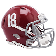
-Helmets had houndstooth on white striping
-Jerseys different a more flat crimson color/material, houndstooth on numbers, American flag on right sleeve, Alabama shield logo on the "V" of the collar
-grey Nike Pro Combat undershirt
-gloves and shoes were also different

There may of been other subtle changes but those were what I spotted. I'm just glad the changes were subtle. I'm not a fan of houndstooth despite Bear's hat having such a huge impact with Alabama. I'm just glad none of it looked like some of the photoshops members did on here last year of the houndstooth jerseys or helmets lol. Nike did a good job IMO.

Nike-Pro-Combat-Zoom-Vapor-Carbon-Jet-Alabama-2.jpg


Nike-Pro-Combat-Zoom-Vapor-Carbon-Jet-Alabama.jpg


Alabama-Nike-Pro-Combat-Gloves1.jpg


Alabama-Nike-Pro-Combat-Gloves-21.jpg


Alabama-Nike-Pro-Combat-Uniform.jpg

Alabama-Pro-Combat-Uniform-5.jpg

4948899100_a73518a0d0_z.jpg
 
Last edited:
Changes were:
-Stripes on legs were much wider both in width of the stripes and space between the two stripes
-Helmets had houndstooth on white striping
-Jerseys different a more flat crimson color/material, houndstooth on numbers, American flag on right sleeve, Alabama shield logo on the "V" of the collar .


I saw them modeled hen Nike unveiled them, I just couldn't see it on the tv.[/QUOTE]
 
i thought they were cool but visually not really much of an upgrade. i'm sure the designers played with the idea, however i would have been interested in seeing a solid white pant that had the houndstooth pattern (as used in the numbering)
 
I thought the jersey and pants were pretty cool. They didn't stand out as well as I thought they may have on television, but still look great close up. I sorta wished someone was selling the helmets along with the jerseys. I liked the way the helmets looked more then the jerseys!
 
Back
Top Bottom